Publicly Critiquing Your Logos !


Thousands of business owners rely on DIY’d logos or low quality designs to be the face of their business. Although seemingly cost efficient for start ups, relying on these types of logos can actually have a negative impact on sales, brand awareness, and growth.
My goal for this critique is that you will walk away with a new understanding & appreciation for branding.
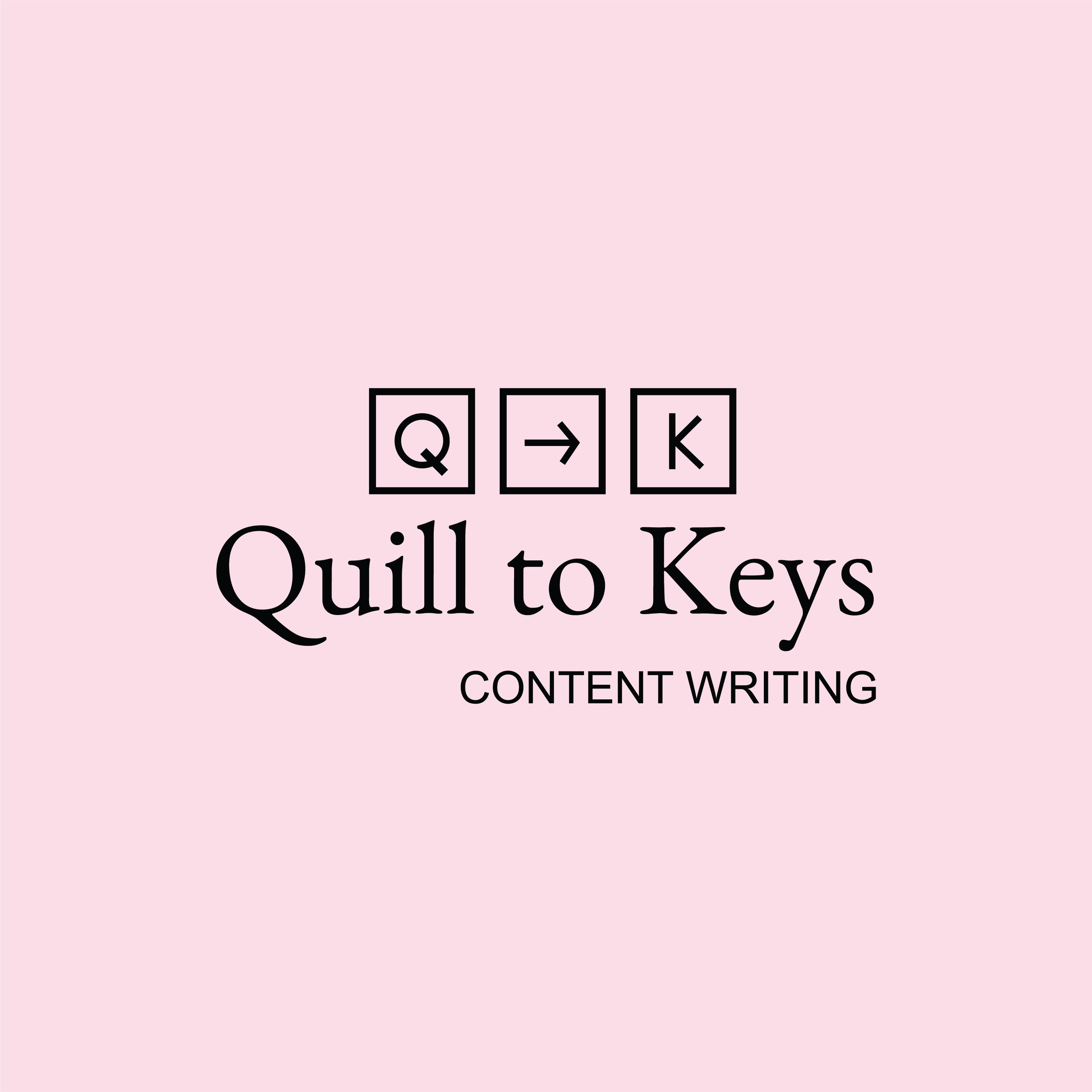
01 This logo is very straight forward and accurately represents what Quill to Keys has to offer. That being said, I feel the actual square keys may be a little too representative resulting in something rather plain than interesting.
I also find it offsetting that there are 3 different fonts, one for Quill to Keys, one for content writing, and another for the squares. Typically logos only use 2 font variations but 3 can work under the right circumstance.
All in all this is definitely not a bad logo but I do feel it could be more abstract and further explored to create something a bit more memorable.
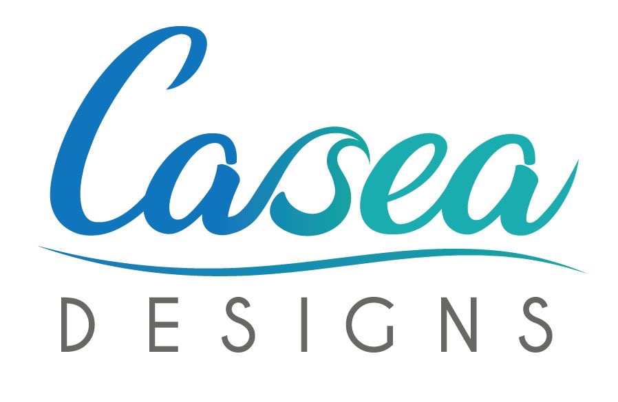
02 To be totally transparent with you guys this logo comes from Casea Designs, who is also a graphic designer and assists on some of my projects from time to time.
This logo is memorable and definitely reads as “gender neutral” which is exactly the type of work Casea produces. The custom made S in Casea is really what pulls this whole thing together and creates that “memorable” feature.
All in all this is a good logo because it’s an accurate representation of Casea’s brand, is simple but still interesting, and incorporates a hand made element.
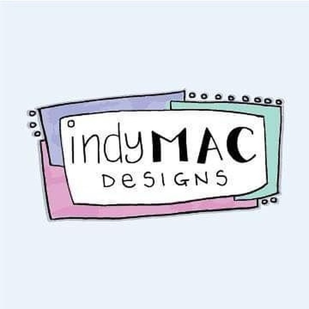
03 Looking over indyMAC Designs products I totally see where this logo was going in relation to the products. That being said, this does not read as a logo, it reads as a drawing.
Although some of their work is very playful another portion of their work is very elegant such as the detailed butterfly drawings or plants. The direction this logo was headed in only represents a small portion of what they fully have to offer.
As of now I think this logo speaks more to children than it would adults and their work isn’t solely created for children. All in all this logo needs some polishing and adjustment to better speak for the indyMAC Designs brand.

04 After seeing the work Ebony Nicole produces I think the top font style & color accurately reflects her brand. That being said, the bottom font definitely needs to be a San-serif because it is in competition with the top font and creates an unbalanced hierarchy.
Aside from that, the fact that her instagram page is called eng visuals through me off. I now realize it is short for “Ebony Nicole Graphic Designer” but I think it’s too far off from the actual logo for people to make that connection which creates a disconnect in the brand.
Lastly, I think there needs to be some other sort of visual element or symbol to help make this logo memorable. As of right now it is just two different fonts. All in all I see the direction this logo is headed but it needs some exploration.
I hope after reading over these you’ve gained some understanding as to why having a professionally tailored brand is so important.
To all those that submitted your logos, thank you. I have confidence that as entrepreneurs you understand my critique is only meant to help and provide constructive feedback.
Strive for continuous improvement, instead of perfection
May 2, 2019

