4 Of The Most Overused Canva Logo Designs Of 2020
If you’re using one of these logos for your business, please don’t take this the wrong way. The main goal of this blog post is to bring awareness to the fact that Canva logos are extremely overused and aren’t ideal for new businesses even though they are free.
If you aren’t familiar with Canva, Canva is a free online graphic design platform that allows users to create social media graphics, presentations, posters and other visual content.
Let’s start with why Canva “logos” aren’t really logos at all.
Logos are supposed to be unique to your business and your business only so when a bunch of businesses are using the same design with slightly different features, it kind of defeats the purpose. On top of that, Canva is not the industry standard and does not produce true vector graphics meaning you’ll likely run into all sorts of issues when it comes to scaling your design or printing on large items.
Since Canva logos are based on a template, you’ll also have issues trademarking your design. No good logo should ever be based on a template, it should be 100% original.
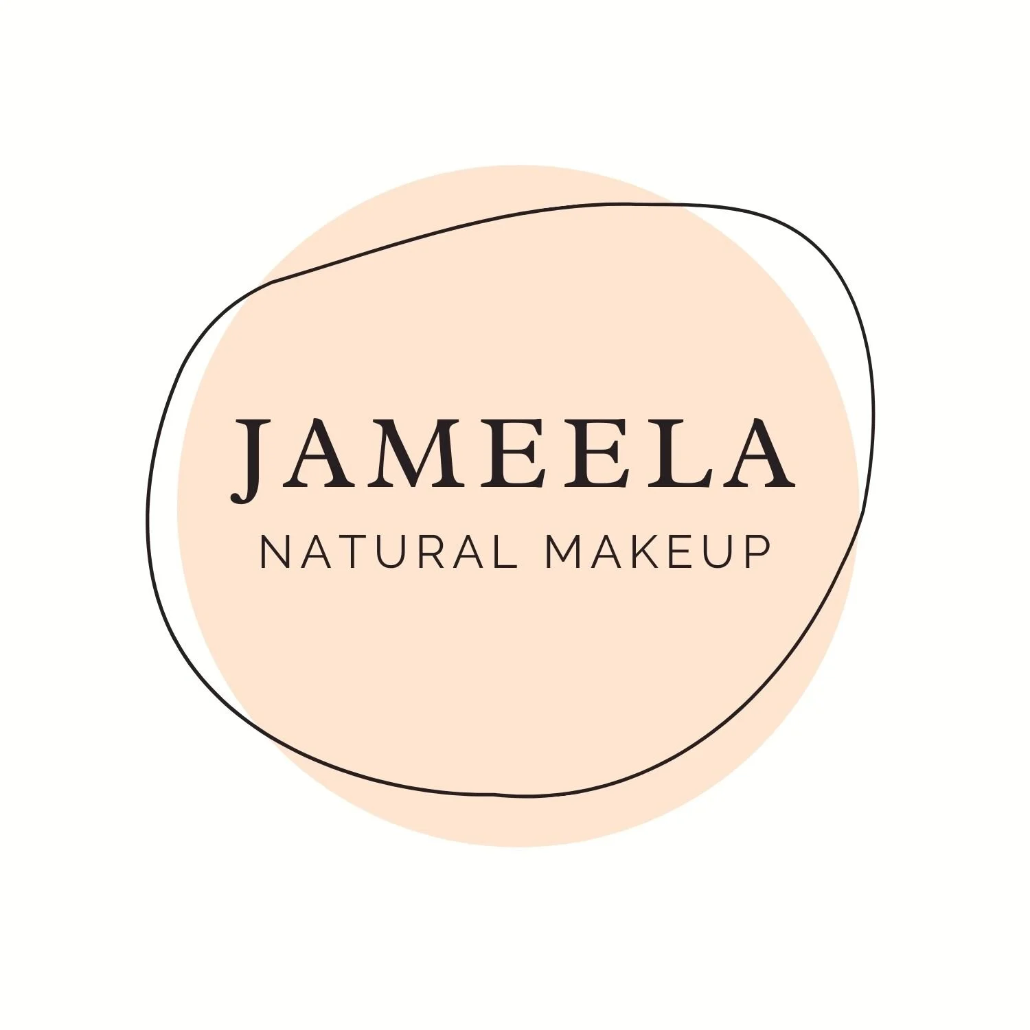
Number 1 | Most overused canva logo of 2020
This circle logo is probably the most overused Canva logo of 2020. I’ve seen nearly 10 plus different accounts with this logo interact with me on social media and it’s very hard to decipher which business is which because they all have the same logo.
Granted they have different colors and different fonts, it still isn’t enough to identify each unique business.
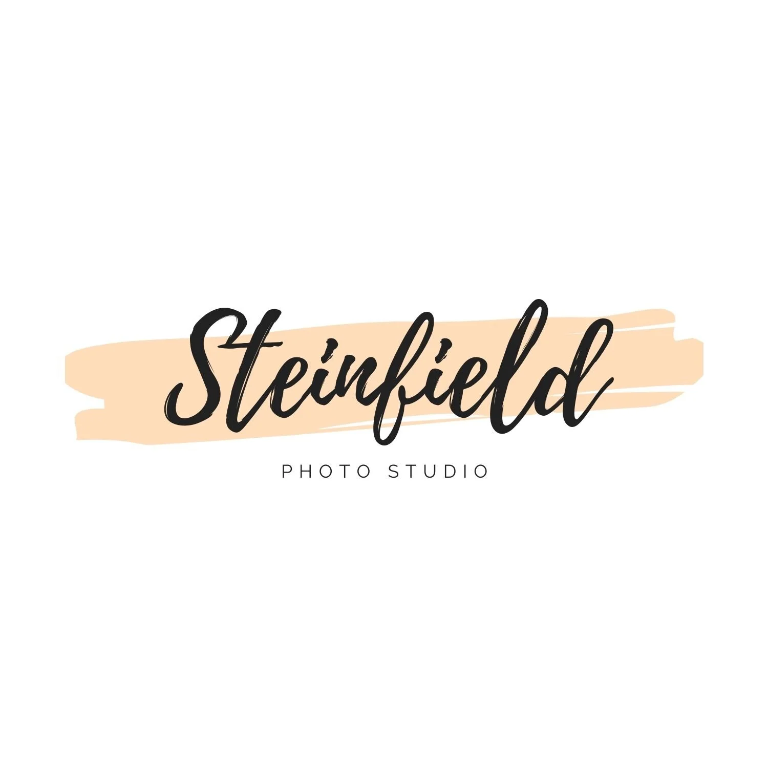
Number 2 | most Overused canva Logo For Feminine Businesses
Last year it seemed like most of the new businesses that were targeting women used this logo. I’ve seen it in all sorts of colors ranging from pink to blue to purple.
I’ve seen it used often for boutiques and marketing businesses.
Number 3 | most Overused canva Logo For unisex service based businesses
I’ve seen this design used countless times for businesses who are taking a more unisex approach and want to appear very professional/high end although using a Canva logo is not the best way to do that.
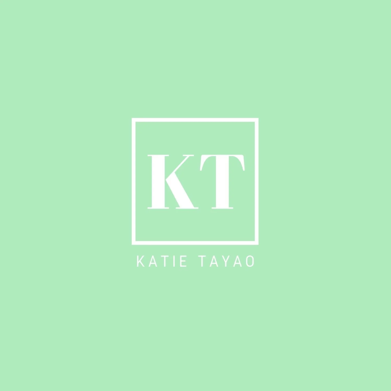
Number 4 | most Overused canva Logo For businesses with a personalized brand name
I’ve seen this logo used quite frequently over the last two years for businesses with a personal brand name since it’s basically initials and a full name condensed into a logo.
Don’t get me wrong, Canva is a great tool especially for creating social media graphics and ads but I would never recommend anyone use it for their business branding. Many new businesses claim they don’t have the budget to invest in branding which is completely understandable but putting $50 to $100 towards semi custom branding or even a one off logo design from a marketplace like Etsy is better than using a free logo on Canva.
Canva logos are created with no strategy whatsoever, typically the process of choosing a business logo involves hopping on Canva, scrolling through templates, and picking the most appealing one.
Strategic business branding requires so much more thought, research, brainstorming, sketches, software, skill, and time. If you’re choosing a logo based on a template and personal tastes, it’s likely not going to benefit your business and later down the road you’ll come to the realization that you need something more custom and strategic to see real results from your branding.
What are your thoughts about Canva after reading this post?
Let me know in the comments!

July 28, 2020
